


1
2
3
4
5
6
7
8
9
Nulgerong
This was our most independent brief and therefore is the one I am most proud of. The initial brief was simply to design a drink brand. I created a client with
a backstory and decided on an appropriate demographic. My inspiration was a trip to Australia where I particularly liked the aboriginal art in the National Museum of Australia. I then proceeded to answer the brief as if the client was real. Every step was my own work from thumbnails to print finish.
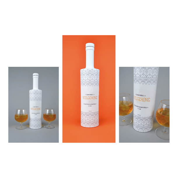
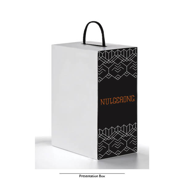
I also created a real sample of the bottle design in order to photograph the end result.
Client
Small family run business looking to expand beyond Australia, potentially into Europe, America and Asia especially Japan due to the increasing whisky market there. Currently they produce whisky within Australia but have now decided to enter new markets.
They therefore need a modernised brand image and possibly a broader product range eg. flavoured whisky’s.
The demographic has been chosen as it reflects the origins of the company. Also young style conscious adults are part of a trend towards more sophisticated drinking with a wide range of choices as people move away from artificial tasting flavoured vodkas, for example, and are seeking more natural and realistic tasting drinks. There is a movement towards less binge drinking in young adults towards more measured drinking where taste and image is important to add to the relaxed social atmosphere.
Demographic
Nowadays bohemians and hippies are often simply people with a style choice rather than the lifestyle lead by, for example, the 60’s hippy. They are social drinkers (therefore the drink image is very important).
They have few brand allegiances, possibly against large corporate labels instead favouring small niche brands, and more interested in the individual product image and discovering the latest new product that few others have heard of. Interested in fair trade and organic products. Young adults, 18-40. They are outdoorsy, adventurous and enjoy travelling. Their style preferences are bold prints, natural textures, leather and natural colours. They are fairly affluent, professional people who are fashion conscious and will want a premium product.
My Process
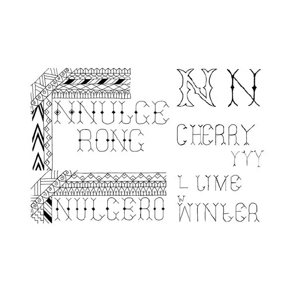
I started by brainstorming the two main themes of this brief, Australia and Bohemians. I found a similarity between the two of freedom, nature and being outdoors and this was the basis for my inital thumbnails.
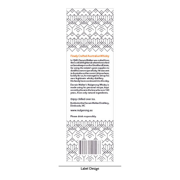
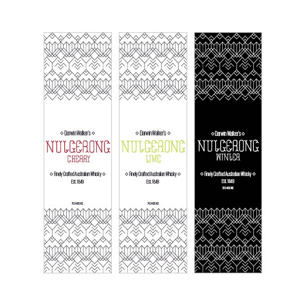
I created a pattern and custom font to represent the brand. My first sketches were, I felt, too complicated and needed simplification before I could translate them into a digital graphic which could be applied to multiple media. Once I had worked on the design in Illustrator
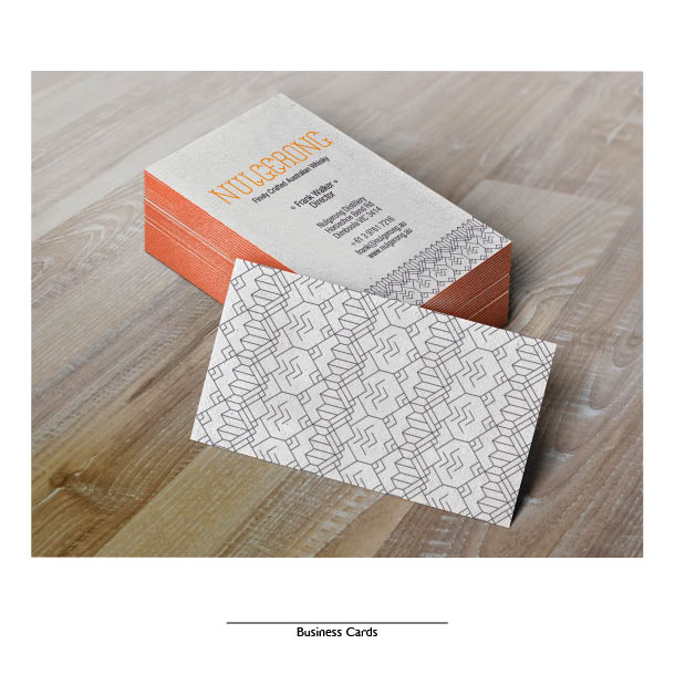
I finalised a design using the pattern as a background with my custom font as the main feature and started
to consider brand extensions. A range of flavours was developed alongside a special edition case and business cards for the clients.